Showing posts with label Mets. Show all posts

Thursday, April 7, 2022

2022 MLB Predictions

I was debating whether or not I would do this, but someone asked and so I am obliging.  I will be honest, I have not paid as much attention this offseason because I was upset with the lockout and further upset about how the powers that be continue to try and destroy the game.  Suffice it to say, I do not like any of the changes that have been made.  But, it’s still baseball, and so here’s my (largely uneducated) predictions:


American League


East


Toronto Blue Jays

            In my opinion, this is the most exciting team to watch.  They should have made the playoffs last season, and the definitely will this year, especially if they can get a full year from Springer.  Biggio also needs to have a big rebound, but they have probably the best lineup even without him at full speed.

Tampa Bay Rays

            They may not look that great on paper, but this team just finds ways to win and so I can’t pick against them.  It’ll be interesting to see just how good Wander Franco can be.  I was surprised about them trading Meadows, and I wonder how that might effect their offense.

New York Yankees

            They had some really interesting transactions this offseason and it’s really hard to figure how good they will be.  They don’t have a lot of depth, especially in the outfield.

Boston Red Sox

            Lots of question marks with this team is why I have them below the Yankees.  Can they piece together a decent rotation?  Will Trevor Story hit outside Colorado?  Can they win with Jackie Bradley Jr. as a regular? (NO)

Baltimore Orioles

            They have some good pieces, and we should see Adley Rutschman and some of the other prospects get a chance.


Central


Chicago White Sox

            Though they are the best team in the division on paper by far, they are not a slam dunk to win it.  They have more potential holes than most people will admit, like second base, the outfield, and the rotation.

Minnesota Twins

            I picked them to win last year, and they were easily the most disappointing team.  They were very active in the offseason, adding Gary Sanchez, Gio Urshela, and of course Carlos Correa.  I think Alex Kirilloff is going to have a big season.  Can Byron Buxton stay healthy and live up to his potential as one of the best overall players in the game?  Will they bring in some arms to solidify the bullpen?

Detroit Tigers

            The Tigers were also quite active, adding Javier Baez and Austin Meadows among a few others.  They are perhaps the biggest “if” team in baseball.  Best case, they are good enough to land a Wild Card spot.  Worst case, the rotation falls apart and they end up at the bottom of the division.

Kansas City Royals

            They should have a solid offense but a very questionable pitching staff.  I am very much looking forward to seeing what Bobby Witt Jr. can do.

Cleveland Indians (err, Guardians)

            I’m not picking them last just because of their stupid new name (you want to change from the Indians?  Fine.  Why not pick the Spiders, something with history that all the fans wanted?)  They’re almost the opposite of the Royals.  They should have a solid rotation, but they’ll be hard-pressed to get any offense.  I’m shocked they signed Ramirez to an extension.


West


Houston Astros

            I very nearly did not pick them to win the division, though most people have them a lock.  Will Verlander bounce back?  Will LMJ ever be healthy for a full season?  The biggest problem is that their weakness is up the middle (catcher, shortstop, centerfield), which you never want to have as a weakness.

Seattle Mariners

            They seem improved and could be an exciting young team, but young teams have a tendency to disappoint, it’s just a matter of how long that will be the case.

Texas Rangers

            Kind of out of nowhere they went all in on two big free agents for the double play partners, Semien and Seager.  There’s no way Semien repeats his massive 2021.  Their pitching is also a massive question mark.  They do look like they’re trying to win, however, which is a sign of hope for the fans.

Los Angeles Angels

            What’s their biggest problem every season?  Starting pitching.  What did they do to fix that?  Bring in Syndergaard who pitching all of two innings last year and none in 2020.  It’s another lost season for Trout, and part of me can’t help but laugh.

Oakland Athletics

            They clearly are not even trying to win this season, and it’ll get even worse once they trade Frankie Montas.  They might struggle to win 50 games, let alone 60.


National League


East


Atlanta Braves

            The defending champions are perhaps better than last year, or at least equal.  Yes, there are still some questions about their pitching.  But they look to have a full year from Ozuna and Rosario, Acuna should return soon, and Riley looks like the real deal.  I also think Freeman for Olson is basically a wash.

New York Mets

            They added Scherzer and Starling Marte, two really good additions.  The biggest question is how long deGrom will miss, like last year.

Philadelphia Phillies

            They added Catellanos and Schwarber, two clear offense-only guys, so their lineup is fairly strong.  They also have two very good starters.  But the rest of the rotation and the bullpen???

Miami Marlins

            They have the makings of a good team, but they’re still probably a year away.  They have the potential of having one of the best rotations in baseball.  If their offense clicks like it could, they will seriously contend for a playoff spot.

Washington Nationals

            Yes, Soto might be the best player in the National League, but if he wins the MVP like some people are predicting that’s crazy.  This team looks really bad.


Central


Milwaukee Brewers

            For the first time…ever, the strength of this team might be the pitching.  They have one of the best bullpens in baseball, and some solid starters in Woodruff and Burnes.  Yelich has to return to MVP form, and Hiura needs to be the bat that they expect him to be.

            --That’s what I wrote last year, and it still holds.  They are slightly less dependent on Hiura, but they still need Yelich to come back from wherever he’s gone the last couple of years.

St. Louis Cardinals

            As someone else said, if you do nothing in the offseason you’re going backwards.  Signing Pujols was a nice sentimental move, but he’s not going to add much, and their biggest hole is the pitching anyways.

Cincinnati Reds

            The bottom three in this division could be very bad.  The Reds still have some good players, but not a lot.

Chicago Cubs

            Yes, they brought in Seiya Suzuki and Marcus Stroman, but the rest of the roster is nothing to write home about.

Pittsburgh Pirates

            What’s to say?  I hate that they are keeping Oneil Cruz in AAA.  Bryan Reynolds is a star, and I hope that Ke’Bryan Hayes gets most of the year healthy.  That’s about it.


West


Los Angeles Dodgers

            Overrated?  Absolutely.  Best team in baseball?  No.  I hate that they have Trea Turner.  Here’s hoping Cody Bellinger continues to be terrible.

San Francisco Giants

            Adding Rodon makes up for losing Gausmann.  There’s no way they repeat the number of career years they saw last year.

San Diego Padres

            I want to love this team.  I want them to win the division.  Tatis will miss an unknown number of games.  Until they show that they’re going to live up to expectations, I’m going to temper mine.

Arizona Diamondbacks

            These bottom two teams are basically a toss up and will probably both struggle to win 60 games given their division.  I have Arizona slightly higher because they do have some potentially decent pitching.

Colorado Rockies

            Kris Bryant signing here is one of the biggest head-scratchers since…Mike Hampton signed in Colorado.  They might have some offense, but I don’t trust their pitchers outside Marquez.


There’s a dramatic change in the playoffs this year and I 1: don’t like it and 2: don’t completely understand it.  Rather than trying to figure out who’s playing whom, I will just list my playoff teams and my World Series matchup.


Playoffs:


AL:

            Blue Jays

            White Sox

            Astros

            Rays

            Twins

            Yankees


NL:

            Braves

            Brewers

            Dodgers

            Giants

            Padres

            Mets


World Series: Blue Jays over Brewers

            Great pitching versus great hitting, this time the hitting wins


AL MVP: Vladimir Guerrero Jr.


AL Cy Young: Lucas Giolito

AL ROY: Bobby Witt Jr.


NL MVP: Matt Olson


NL Cy Young: Corbin Burnes

NL ROY: Oneil Cruz


Tuesday, March 5, 2019

National League Uniforms


With the American League down, let’s look at the National League uniforms.

National League:

Atlanta:


Grade: C+

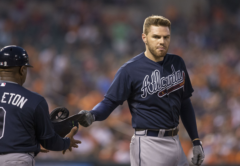
Let’s get this out of the way: I do not like the cap logo.  That “A” is too similar to Alabama (though I do know the difference).  The only jersey I really like is the home white with the “Braves” over the tomahawk.  I have never really like the alternate blues, especially since it is blue on blue.

Best: 1953-1962


The Braves started wearing the script “Braves” with tomahawk back in Boston in 1946, and they stuck with that until 1962.  This look was re-introduced in 1987 and has remained the same since.  I picked these uniforms because Milwaukee is always superior to Atlanta and these are the Aaron/Spahn/Matthews days.

Worst: 1976-1979


Usually I like pinstripes, but not these.  I am also not a fan of the road uniforms, the script “Atlanta” is a bit too big.

 Miami:


Grade: F

What are they doing in Miami? They have never really had good uniforms, but the new 2019 uniforms are hideous.  Some of them you cannot read the lettering, some of them are just garish.  Thank goodness they are so irrelevant as a team.

Best: 1995-1996


The Marlins have never had great uniforms.  At best these teal uniforms would be around a “C”.

Worst: 2019

They haven’t really worn them yet and they’re already terrible.

New York:


Grade: B+

No biases here: the Mets “NY” is better than the Yankees’.  The Mets’ home pinstripe whites are fantastic, some of the best in baseball.  The other jerseys are basically average, which is why the overall grade is lower, though the blue alternate home jerseys are pretty nice. 

Best: 1985-1986


The Mets have had somewhat similar uniforms throughout their history, and pretty much all of them are nice.  I was tempted to say the 60s version was best, but I can’t help it, I like the stripes down the sleeves and pant legs.  In 1987 they switched to a script “New York” on the road uniforms, but I actually prefer “Mets” in this case.
  
Worst: 2001-2011


It might be hard to tell, but during these years they had black road caps.  That’s the only thing distinguishing these as “worst.”

Philadelphia:


Grade: C+

I think I like the alternate home whites a little more than the pinstripes, but that’s because for once I am not a huge fan of the home pinstripes.  Maybe if they used a little more blue, like the alternate whites, I would like these more.  The caps are fine, nothing special.

Best: 1973-1988


I can’t help it, when I think Phillies, I think Mike Schmidt and these uniforms.  I like both the home pinstripes and the road blues. 

Worst: 1942


Maybe they went basic for the war, I do not know, but these uniforms are just boring.  They also did away with red in their uniforms during the war years, which is not right for the Phillies.  I also am not a fan of just “Phils” on the road jersey.

Washington:


Grade: B-

For one thing, the Nationals have way too many alternates.  My biggest problem is that I don’t particularly like any of the jerseys, except maybe the alternate blue home with script “Nationals.”  This is why I kept wanting to buy a Bryce Harper jersey but could never decide on which version to get, because they are pretty much all okay but none of them stand out.  I do like the script “W” logo for the caps (but again, too many alternates).

Best: 1980-1991


Maybe I am cheating a little bit, but these Expos jerseys are some of the best in baseball history.  I love the red/white/blue caps.  I love the red and blue piping.  I also love how their logo, which is the second-best in baseball history, dominates the jersey and cap.  Amazing.

Worst: 2005-2010


The first rendition of the Nationals jerseys were quite ugly.  I do not like the large block lettering on the jerseys.  It’s like they were the last of that trend from the late-90s/early-00s. (Most specifically, these are the worst "Natinals" jerseys.)


Chicago:


Grade: A+

I am not a Cubs fan, but I have to say if there are perfect uniforms, these are them.  The home jersey with the pinstripes and the logo on front is fantastic.  The alternate blues are great.  Even the road grays are good with the blue name and red numbers.  Just great all around.

Best: 1997-present


I gave it a perfect grade so I have to stick with these as the best.  The Cubs’ uniform history is pretty interesting, and not nearly as “uniform” as you might think.  That being said, the home jersey has been nearly the same since they introduced pinstripes in 1957.

Worst: 1918


I am not sure what is going on with these road uniforms.  I really don’t know what to say.  And green socks?  Yeesh.

Cincinnati:


Grade: C

You can probably guess why I have these ranked this low.  The home whites are boring.  The alternate reds are ugly.  The road grays are boring.  To be honest, the Reds don’t have a great history of uniforms.

Best: 1958-1960


I am not really a huge fan of any Reds uniforms, but these are the best because of the cutoff sleeves and the fact they make me think of Frank Robinson.

Worst: 1972-1992


Jeez they wore these for a long time, throughout the Big Red Machine and past the 1990 World Series.  These are the worst of the 70s pullover jerseys.  You just look at them and think “polyester.”

Milwaukee:


Grade: B-

The worst thing about these uniforms are the caps with the “M”.  I definitely prefer the alternate dark blues, but the others aren’t bad.  Of course, all of the new uniforms pale in comparison to those from the 80s, which at least are alternates.

Best: 1978-1984


I all of the pre-1994 Brewers uniforms, but these are the most iconic.  The home jerseys are the perfect pinstripes and the blue cap, which was worn through 1993.  The road blues with the script “Milwaukee” and the blue and yellow cap are clearly the best they’ve ever had.  And, of course, that logo is the greatest in the history of sports.

Worst: 1994-2000


They changed from blue and yellow to blue and green and they got rid of the iconic logo, to name just a few things they did wrong.  In 2001 they switched to what they were now, which is a slight improvement.  They never should have moved away from their best uniforms, but at least they wear them as alternates now.

Pittsburgh:


Grade: A-

I am a big fan of the black and yellow (and I love that all Pittsburgh teams use it, makes it easy to be a fan).  The home whites are really nice, and I also really like the alternate blacks.  The font makes it all really work.

Best: 1957-1969


The Pirates wore blue and red until 1948 when they switched to the black and gold that looks so good now.  For some reason a lot of people like the 70s look now, but for me the Pirates peaked with the sleeveless look of the Clemente days.

Worst: 1997-2000


I was tempted to go with the late-70s/early-80s garish look, but there are two big problems with these years.  First: the gray cap for the away uniforms.  Second: the pinstripes with the gray away jerseys is not a good look.

St. Louis:


Grade: A

More great, classic uniforms, these are really close to the Cubs for best.  I love the “StL” logo on the hats, but the birds on the bat are outstanding.  My minor quibble: I wish the road grays had “St. Louis” in script like the alternate creams.  Speaking of which, I am not a huge fan of those, which also knocks them down just a tad.  I do like that they are bringing back blue road alternates this year.

Best: 1949-1950


The Cardinals have been wearing the bat and birds on their jersey almost continuously since 1922.  That means they have almost always been good.  I realize that since they are the Cardinals they should have more red, but I actually like it better when there is the blue mixed in.  These years they wore the blue caps.  Plus, these are prime-Musial years.

Worst: None

I can’t really pick anything because any that I do would be nick-picking.

Arizona:


Grade: F

So many choices, all of them hideous.  I don’t really know where to begin.  They went full modern and, for me, that was a huge mistake.  Most of them at least have a similar feel, except the two alternates with teal, which are the worst.  I also don’t like the red they use to begin with, which is similar to the brick red the Astros used, which I also did not like.  Yikes.

Best: 2001-2006


This is kind of relative because I don’t think any of theirs has been particularly good.  These get the sentimental bump, if nothing else, for the World Series win in 2001.

Worst: 2016-Present

See above.

Colorado:


Grade: D

The Rockies, surprisingly, have had the same uniforms for their entire history (only that from 2000-2011 they had pinstripes on the road grays).  I say surprisingly not only because most new franchises have changed frequently but also because they are incredibly boring.  They are just so plain.  Only the alternate purples are somewhat interesting.

Los Angeles:


Grade: A

Similar to the Yankees, Red Sox, Tigers, Cardinals, etc.; classic, nearly perfect.  For some reason I feel like the road grays could be a little better, but I’m not sure exactly how.  Maybe if it ain’t broke…

Similar to the Yankees, it’s not really worth it to do a Best/Worst.  The uniform has essentially remained the same since 1938, changing only from Brooklyn to Los Angeles.  There were not any particularly bad uniforms before then.

San Diego:


Grade: D+

The Padres had great uniforms for most of their history until they changed to the blue and white uniforms about 15 years ago.  Now they are incredibly boring.  At least the camos that they have made regular alternates are interesting, a nod to the naval presence in town.

Best: 1995-2001


This is actually tough because, unlike most people, I really like the brown and yellow jerseys of the 70s and 80s.  I also really like the brown pinstripes of the late 80s.  This one, though, was the Caminiti years, and I really like their blue and orange (surprise, surprise).

Worst: 2004-2010


That road sand color…yuck.  I get it, San Diego, beaches, sand, but not on a uniform.  And even the lettering on those is bad.  At least they went away from those for the current uniforms.

San Francisco:


Grade: B-

The regular home whites and road grays are definitely better than their alternates, which are mostly misses (well, maybe the alternate grays are better than the regular ones).  This is one time when I think I prefer the single color caps over the orange brim caps.

Best: 1906


In the first 50 years of the 20th century, the Giants uniforms were all over the place.  Some were quite nice, some were not.  I have to give them credit for this most of all.  How awesome to walk into every game proclaiming you are the best. (San Francisco best: I like the 1983-1993 version with just the “SF” on the road jersey.)


Worst: 1916


Checkered uniforms.  Yes, this happened.  (Runner-up: the 1977-1982 ugliness.  I don’t understand why these are alternates now.)